Wednesday, June 3, 2015

week 12 - Submission and Screenshots

Final Submission Links:

Mashup
Perspectives
Plan Development
Textures
Moving Elements
Image Captures

Sketchup Model Warehouse: https://3dwarehouse.sketchup.com/model.html?id=u516b7042-b382-404d-bd55-2eff58896b06&uploadsuccess=1

Lumion Files: https://www.dropbox.com/sh/yzrozts4kp37rkx/AAATUKzZ04LuYtQL402f6jBMa?dl=0


Feedback Sheets


Image Captures

*Notes
1st floor: Academic and general staff offices, meeting rooms for students and staff, gallery, computer lab, 
2nd floor: Library - connected to the first floor gallery
3rd floor: Workshop and studio spaces.
4th floor: Research space and Lecture hall


The First image that i chose is the location of the building, The location of the building being at the front of the university would be the one with the most impact, the life quality of the building would already be improved by the position and orientation it is on.


The Timber screens enhance the impact of the daylight by creating patterned shadows in different times of day while providing shading, creating a certain form language that results in a unique effect.


The lack of solid walls between some parts of the building such as this one(the general and academic staff offices) create a larger intake of daylight and also improves the percieved degree of life by removing limiter-like walls.


The Studio area overlooks the road and neighbouring buildings, providing a more open outlook when thinking. The daylight entering can be changed through the sunshading above and the overall daylight entering the room reduces the need for artificial lighting and improves the percieved degree of life.


The movable sunshading helps to give the building a larger presence as well as control over the intake of daylight. The sunshading over the road also provides shade over pedestrian areas, particularly the bus stops and sidewalk.


week 11 - Textures and moving elements

Textures


Applied on the model


For the narrow hallways, i applied the fork texture to give a linear sense that wasn't too narrow.


The Scalar texture was used in the intersection between the meeting rooms, computer lab, and the larger sections of the building such as the gallery. This is to help with the transition to such spaces.


The Transition texture was used in the hallways in front of the studios, to give a directional sense that works both ways to and from the studio area.


Moving Elements


3 Movable sunshades, one in the bridge over the entrance and two in the bridge over the road

Sunshades closed 


Sunshades opened.


week 10 - Plan

House For a New Media Collector - Herzog and de Meuron


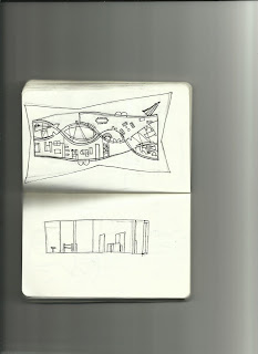
House Plan Sketched


Plan Developed using ideas from the earlier sketch


Bridge/School Developed from plans.

Tuesday, May 19, 2015

Week 9 - Perspectives and draft moving elements

One - Point Perspectives


Two - Point Perspectives


Moving Elements : Draft Screenshots


.

I decided to add in a pair of movable sunshading over my building, the trial for each one showed that it would cover quite a wide area.


Week 8 - Mashup

The perceived quality of life in buildings and urban spaces comes from the geometry,  and optimizing building orientations to choosing interior surface qualities, and how that connects to the individual architecture is a public good.

A building’s geometry is a result of applying a particular form language chosen by the architect.what any one person or institution builds, others must live with, and often for a very long time. Daylight, for example  is a feature that helps determine, to a large extent, the emotional and physiological response of the user,  as well as a highly cost-effective means of reducing the energy for electrical lighting and cooling. The sun  can aim at  improving the perceived degree of “life” in the building through  providing basic information like time and weather and supports visual performance as well as comfort, This can be maximized through the  form language of a building.


Light can be used to maximize The perceived quality of  the life of our inhabited places. as an art and that that everybody deserves to enjoy precisely because it constitutes the life of our inhabited places.


References:

            Thomas Schielke, "Light Matters: 7 Ways Daylight Can make Design More Sustainable," http://www.archdaily.com/471249/light-matters-7-ways-daylight-can-make-design-more-sustainable (Accessed 10 june 2015).

             Nikos Salingaros, "Unified Architectural Theory: Chapter 3,"  http://www.archdaily.com/447456/unified-architectural-theory-chapter-3/ (Accessed 10 June 2015).


              Sarah Williams Goldhagen, "Architecture is More Than Just Buildings: In Rememberance of Ada Louise Huxtable," http://www.newrepublic.com/article/art/111828/architecture-more-just-buildings-in-remembrance-public-minded-critic (Accessed 10 June 2015).

Sunday, May 10, 2015

Week 7 - Textures and submission

In this week, we were asked to create textures and apply them to our sketchup model. The sketchup model has electroliquid aggregation applied to it as well as the textures and then imported to lumion.


These textures are inserted into the sketchup model


And then imported into lumion, where a site was built according to the blacktown site.


The marker features a low long multi-layered horizontal form with stairs over the sides to access the multiple levels. The low horizintal form is surrounded by trees and is ideal to relax in a vicinity close to the stadiums.


Link to warehouse and dropbox:


Dropbox: https://www.dropbox.com/l/ft0mfMXCldApamxPg7mzJt

Warehouse: https://3dwarehouse.sketchup.com/model.html?id=u93c254ff-48b3-4871-bf82-91a46d4d7d80


Week 6 - Parallell Projections

In this week, we combined 2 of the axonometrics into one to create a marker, this marker will then have an electroliquid aggregation put into it.


----------------------------------------------------------------------------


--------------------------------------------------------------------------------


This one has been chosen as a marker, developed in sketchup then imported into lumion.